:06 min Anne Susanto Breakdown Banner. She talks about the 4 top things you need to look for.
:11 min Rule of Thirds
:13 min Best Colors and Fonts
:17 min How can you tell if your banner is really big?
:20 min https://nerdvanaoutpost.com/
Nerdvana (Retail Store)
Kristen Laidig
:32 min https://deepend.me/
Deep End (Apparel)
Alyssa Isogawa
:45 min https://www.littlezenone.com/
Little Zen One (baby niche)
Allie Dennis
:62 min https://pawzworld.com/
Pawz World (Dog Canvas)
Irene Offord
:74 min https://www.romadesignerjewelry.com/
Roma Jewelry (Jewelry Store)
Devin Devis
:86 min https://arbucklecoffee.com/
Arbuckle Coffee (coffee store)
Josh Willis
:108 min https://tryblossom.com/
Try Blossom (niche store lotion)
Archer and David Worsham
:139 min https://sifri.co/
Sifri (jewelry Store)
Jonathan Loynaz
:155 min Bonus session with Marcel Yuwono
How do I find the best product to sell?
BONUS MATERIAL FROM ANNE
Since most banners I’ve seen miss the mark on some or all of the banner best practices, I thought I’d type them up, plus some other things I remember saying or meant to say on zoom, and share it here in print in case it’s more helpful that way.
. . . . . . . . . . . . . . . . . . . . . . . . . . . . . .
First thing’s first: KNOW YOUR BUYER AVATAR!
Your copy, imagery, product selection, ad creatives, offers, er’thang should speak to/appeal to/ trigger your buyer avatar. So if you don’t know yours, it’s a good idea to start here. (Check out GSD #14 – July 2018)
THINK OF YOUR BANNER AS THE FACE OF YOUR BRAND
Your banner serves as the face of your brand. So it shouldn’t be an after-thought.
“Even if you’re sending your visitors to your product page, they will go to your home page to see if you are a brand they want to give their money to. Your banner is your most valuable real estate on your store.” – Some guy at BGS
BANNER BEST PRACTICES
You have seconds to convince your website visitor to stay. You can do this with a well-executed banner.
BANNER MUST-DOs:
-
ANSWERS WHAT, WHY, HOW IN SECONDS
-
IS COMPELLING, CONCISE, AND CLEAR
-
SPEAKS TO YOUR BUYER AVATAR
-
LOADS QUICKLY (applies to all website images)
ANSWER WHAT, WHY, HOW
Your visitor should know these 3 things within the first 3 seconds or they’re likely to bounce:
-
WHAT am I buying?
Your product or offer is INSTANTLY identifiable.
-
WHY should I buy it?
Your UVPs are concise, clear and compelling.
-
HOW do I buy it?
Your call-to-action stands out.
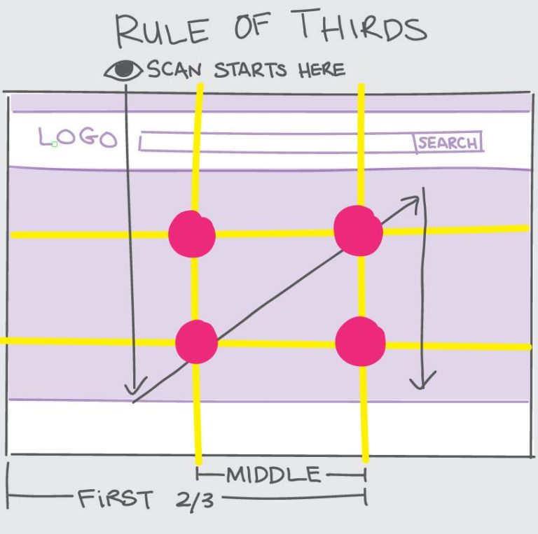
GOOD LAYOUT: Use the Rule of Thirds for Better User Experience
The layout of your banner (your whole site, really) can make things easier to read and more pleasing to the visitor’s eye. This in turn leads to a better user experience which gets them to stay longer on your site and increases the chance that they will purchase something.
Good layout =️ Better user experience = Longer staying time = More conversions
The Rule of Thirds is a design principle that helps you determine where the most important elements should go on the page.
Unless redirected with arrows or a pattern interrupt, visitor’s eyes natural follow a pattern [as shown in the post photo] when they land on our site (above the fold).
The eye naturally scans from the top left, down, then to the top right then down. It associates the areas in the intersections [the pink dots] as most valuable.
So the most important elements of your banner should go in the middle or first 2/3 of it.
IMAGES AND VISUAL ELEMENTS: Must Serve a Purpose
Imagery on your banner should:
-
serve a purpose
-
capture attention and add to the message, not take away from it
-
evoke emotion, inform and/or highlight benefits
Really all images and visual elements throughout your site should communicate valuable information and serve a purpose—don’t add images just for the sake of it.
COLORS: Helps with Credibility and Visual Hierarchy
Stick to 2 to 3 colors for your website’s color scheme.
Brand Credibility:
People associate your color scheme with your brand. Having all the visual elements of your store, including color scheme, align with your brand lends legitimacy and credibility to it.
Visual Hierarchy:
Colors can bring attention to the most important elements
Important copy: Use contrasting colors to highlight the most important copy. The more important the copy, the more contrasting the colors should be (black font on light background, white font on dark).
Call-to-action: Use a color that stands out from the rest of your color scheme BUT is still congruent with the rest of the site.
(I can go on and on about colors but those are the most important in terms of your banner.)
TYPOGRAPHY: The bolder and bigger, the easier to read
Your text, especially UVPs and call to action, should be instantly readable.
Font choice:
Bold, blocky font is easier to read than fancy, cursive font. The bolder the font, the easier to read, especially on mobile.
Size matters:
Direct the viewer to the information you want them to see via the order and font scale of your text. In other words, use biggest font (on contrasting background color) to draw the viewers eye to the most critical information, with the most most critical info first.
Frame it:
People’s eyes are naturally drawn to stuff inside a frame, so a clearly defined border (even if it’s white space) can help highlight important copy.
If your banner has imagery, set the text in some sort of frame so it stands out.
Ideas:
If your banner is white, you can put a subtle light, thin border around the copy to draw the eye’s attention to it.
BULLETS: USE THEM
People will look at lists with bullet points more than they do any other formats
LIFESTYLE IMAGES AND HUMAN FACES
Evoke emotions:
A human face can trigger the viewer’s emotions more effectively than any other imagery.
If done properly, you can use facial expressions to influence how your visitor feels about your product.
The key is to use human imagery that is relatable or appealing to your buyer avatar and/or evokes emotion..
Influence navigation:
You can also use humans in your imagery to direct people where to look. If you have a photo of someone looking at your headline or CTA, for instance, your website visitors will feel compelled to look there, too.
IMAGE FILES AND LOADING
Your image file sizes can make or break your site.
Check your website load time performance through a service like gtmetrix.com or pingdom.com.
If your site loads slowly, there’s a good chance your failing grade is a result of large image files.
Use JPG and SVG files for faster loading
JPG or SVG for banner and product images.
PNG for uvp icons and logos.
Compress ALL image files
There are apps that will compress image files on the fly, but it’s best practice to compress ALL image files (banner, product photos, UVP icons) with a service like tinypng.com and save them to the server already compressed.
Resize your product images to 600×600 (800×800 max)
If you’re displaying large product images (POD platforms mock-up images are notorious for this), you can instantly improve performance by reducing your image sizes.
For example, if your theme displays product images at 600×600 pixels but your images are saved as 1000×1000, resize your images and save them as 600×600 rather than forcing the site to load 1000×1000 images and scaling them down to 600×600. Each image that has to be scaled down before it’s displayed adds to the load time. Yes this can take a bit of work especially if you have lots of SKUs and variants, but it’s 100% worth the effort and can be done by a VA.
TEST WHAT YOUR BANNER AND ABOVE-THE-FOLD LOOKS LIKE ON DIFFERENT SCREENS ESPECIALLY MOBILE DEVICES
Chances are the bulk of your visitors are coming to your site on mobile devices. They may not all be buying on mobile, but most likely they’re viewing on mobile first.
The banner you display for desktop view will not always work well for mobile view. In fact, it rarely does. So if you’re using the same banner for desktop and mobile views, be sure to optimize for mobile view first.
In fact, it’s a good idea to test how your above-the-fold looks on different screen resolutions, especially if your GA data is telling you that a significant number of your visitors are coming to your site on devices like tablets.
There used to be an online tool called screenfly.com; you could enter your URL and toggle between screen sizes with a click. Sadly, it’s no longer available so there really was no point in me typing this out.
I haven’t found a replacement that even comes close, but here are two options that let you toggle your view:
-
google chrome extension called Window Resizer does an okayish job. Once you add the extension, you can click on its icon, select from a few different screen sizes from the drop down menu and your chrome browser will resize to emulate the screen size you chose.
-
the tried and true F12 function (this may just be a chrome thing) that let’s you choose various mobile views. Open your site in chrome browser, press F12 and select your view from the drop down menu.
. . . . . . . . . . . . . . . . . . . . . . . . . . . . . .
That’s all.