:06 min – Ane introduction
:08 min – What is your strategy with Testing
:26 min – How many products should a P.O.D start start with?
:30 min – Do we need a good variety?
:42 min – What combo of merchandise is the best to sell?
:44 min – What is your recommended budget for starting your P.O.D.
:48 min – Do you maintain a FB and IG account with your brand?
:53 min – How do you create content for FB & IG?
:57 min – At what point are people loyal to the brand?
1:03 min – Do you know of any P.O.D. vendors that allow for customers to add inserts?
1:05 min – What’s your advice for a new P.O.D. starter?
1:14 min – How do your price your P.O.D. products?
1:17 min – Do you exclusively sell on Shopify?
1:20 min – Appr for personalization?
1:24 min – How can I attract initial attention to my store?
1:33 min – Would you use 2 different P.O.D. shipping companies?
1:41 min – What do you use to compress your P.O.D. images?
BONUS MATERIAL
-
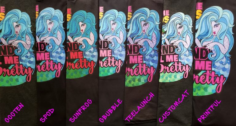
Printful
Outstanding all around -
Gooten, Sunfrog, Teelaunch
Good enough print quality, but ordering more samples on larger sizes to see how the print is scaled -
SPOD
Crisp and vibrant, BUT print looks like an iron-on and ink is already peeling up even before any wear or wash -
Gearbubble
Decent print quality BUT design is not scaled to size (design on XL shirt is same size as on XS shirt and looks awkward on the larger size). -
CustomCat
Print quality is bad across all the samples, blurry, visible print lines, peeling, fading.
The same design file was used for all samples but resizing was necessary to meet the upload requirements of a few of the platforms.
-
Shopify integration: How easy is the app to install and configure? Easy to use interface? Easy to add products, variants, mock-ups? How responsive is app support?
-
Turn around: How fast does the order go from “purchased” to “delivered”?
-
Good communication/client support: How well do they communicate delays, inventory issues, shut-downs. Shit happens, but as long as issues are well-communicated in a timely manner, we can pivot, adjust and communicate with our customers.
-
Capacity: How well do they respond and adapt to high-volume periods, like BF/CM and holidays? How do their facilities respond during crisis?
-
Cost of goods and shipping: How competitive is the pricing? Is volume pricing offered? Is there multi-item shipping discount offered?
-
Scalability: What other products does the platform offer?
So stay tuned for the follow-up cause that also may or may not be helpful!
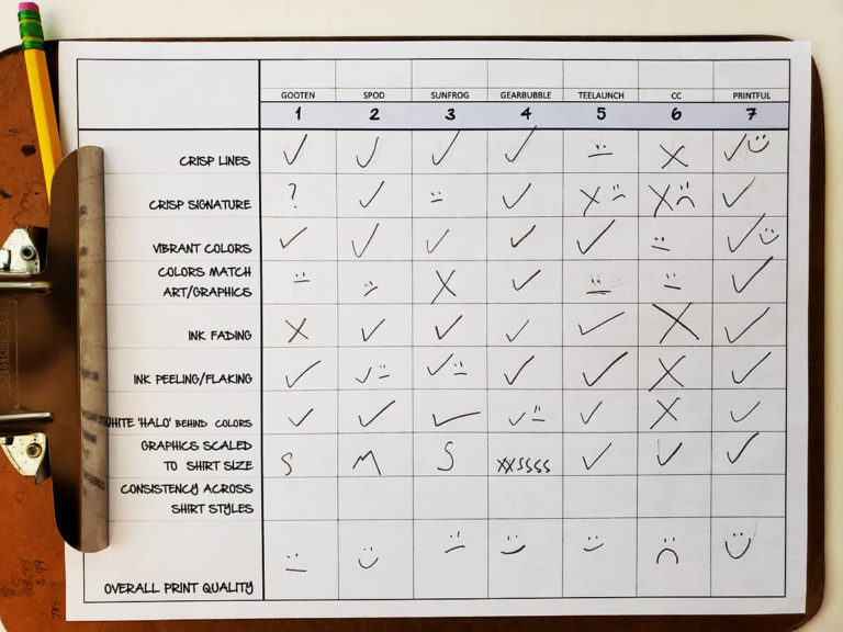
EXPLANATION OF CHARACTERISTICS:
How clean and crisp are the lines of the design? How much detail comes through on the print?
-
Important for detailed and intricate designs.
-
Not as important on designs with big block lettering or simple graphics.
How crisp and instantly identifiable is the “artist signature”?
-
Very few people will care about this, but this is important to me because my “artist signature” is part of my branding. BUT this also serves as a benchmark of how detailed the design can be printed on the shirt.
How well do the colors show up on the print?
-
Important if the design has lots of bright and bold colors.
-
Not as important for 1-2 color designs.
How closely do the colors match the artwork/design file used to print?
-
Important for managing customer expectations—when the actual product vastly differs from the mock-up, this can result in a bad customer experience with your brand. Especially important if the colors themselves have meaning, like team colors or flags.
-
Not as important if the design only uses white, black or grays.
Are there areas on the print where the ink is faded or printed unevenly?
-
Important for clean, detailed designs.
-
Not as important for distressed, “worn-in” designs where the print is intentionally faded in areas.
Are there areas where the print is lifting, peeling or flaking?
-
Important no matter what. Print peeling or flaking off leads to a bad customer experience.
How much “white underbase” shows through under the colors? (When a design with colors is printed on a dark shirt, most DTG printers first print a white underbase onto the shirt. Sometimes this leads to a white “halo” effect around the colored areas if the underbase and color layers aren’t aligned properly.)
-
Important for detailed designs with lots of color. And because it’s a pet-peeve of mine.
-
Not as important for designs with white-only lettering or graphics or for prints on white or light colored apparel.
Is the same size design or graphics used for all size shirts? Or is the designed scaled properly on larger sized shirts?
-
Important for XL-4XL sizes. If not scaled accordingly, the design will look awkwardly small on larger sized apparel.
-
Not as important if you love negative reviews and comments on your posts.
Is the print quality consistent from shirt to shirt for each POD platform?
-
Important if you’re offering various shirt styles and want a consistent look for all your products.
-
Not as important if you’re only offering a single style.